
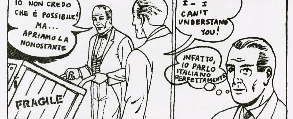
Joe Brainard from The Complete C Comics
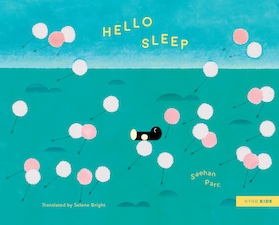 Hello Sleep
Saehan Parc / Selene Bright
NYRB Kids
Written and illustrated for kids ages 4-8, Hello Sleep is a bedtime tale that imagines Sleep as tiny creature (which I interpret as about the size of a kitten with black fur and white paws, but it may not be fur, those might not be paws, and given the propensity of the creature to stand upright, it probably isn’t a kitten either). The story asks of the reader, After Sleep has kept busy seeing every person, plant, insect, and animal off to sleep, when does Sleep ever get to Sleep?
The question arises, because Sleep is late in arriving for a child in bed, who asks at the outset, “Hello, Sleep! It’s me. Remember? We’re supposed to get together.” We see Sleep going about its duties but Sleep itself is getting tired and begins to wonder when its turn will come. Sleep sets off to enquire about its problem, but everyone it visits to talk with is . . . well, asleep. Since no one is awake Sleep can talk to, Sleep, by itself, “lie[s] down on a dandelion seed, and the wind rises, rocking [it] gently.” Rising and falling with the current of the wind isn’t enough to put Sleep to sleep. Sleep tries over a dozen different ways to sleep (illustrated), all of which fail. Our hero does eventually fall asleep, and we get to see what Sleep dreams.
The world Saehan Parc has created with her illustrations is filled with simple shapes and calming pastel shades, with dozens of images children can use for their own flights of fancy into dreamland.
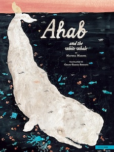
Ahab and the White Whale
Manuel Marsol / Chloe Garcia Roberts
NYRB Kids
An excellent exploration of imagination and psychology for kids 5-9, a series of events in which what one is looking for is always already there, if you know how to look. First-rate illustrations (with lots of details to wonder over) and spare yet effective narrative (translated from the Spanish by Chloe Garcia Roberts). Grown-ups familiar with Moby-Dick and 19th-century American lit will enjoy the in-jokes appearing on the putative map of Nantucket as endpapers, although this book’s Ahab shares only a name and infatuation with Melville’s Ahab. A great addition to any kid’s library.
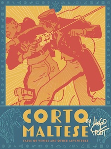 Corto Maltese: Fable of Venice and Other Stories
Hugo Pratt / Dean Mullaney & Simone Castaldi
Fantagraphics
Hugo Pratt was a successful mid-century cartoonist originally from Italy, but who alternated between Italy and Argentina for much of his adult life before finally settling down in France. Pratt was used to travel, having spent part of his childhood youth with his parents in Ethiopia. Not surprisingly, his adventure comics match their creator’s international background. Corto Maltese, an adventurous sailor of indeterminate age, was Pratt’s most popular character.
The tropical and semi-tropical oceans and isles of piratical lore, of buried, sunken, and hidden treasures are all known to Corto. Secret societies, arcane rituals, old maps and ruins, duplicitous adversaries, fumbling professionals, and femme fatales inhabit Corto’s world (although Pratt seemed incapable of drawing a decent-looking woman). The plots feel are often contrived shaggy dog stories, but the adventures succeed in delivering lots of swashbuckling adventures of derring-do.
Pratt’s drawing style owes heavily to Milton Caniff of “Terry and the Pirates”—lines rough but clear, panels paced to maximize speed and drama. Clean fun for all ages.
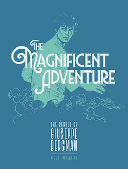 The Magnificent Adventure: The Perils of Giuseppe Bergman, Book 1, Volume 2Milo Manara
Fantagraphics
An acolyte of cartoonist Hugo Pratt influenced also by Moebius, Milo Manara is an Italian cartoonist whose action hero Giuseppe Bergman’s adventures were inked in the late 1970s. Bergman, a lusty young man who appears to be in his early 20s, wishes for an adventure as an antidote to his mundane life. A mysterious man named HP (as in “Hugo Pratt”) grants his wish, telling Giuseppe that in exchange for adventure Giuseppe must make his tale available to a wide audience that demands entertainment—a post-Modernist, self-referential move that makes the derring-do feel contemporary while simultaneously aping the tropes of adventure comics.
Giuseppe is taken on a series of adventures, starting in Venice then wending through various parts of South America—Garcia Marquez’s Macondo, the Orinoco and Amazon Rivers—where he tangles with local fauna and tribes, gets mixed up with European travelers of various questionable motivations—and pairs up with a nymphomaniac in the name of rescuing her. Some R-rated erotica here, folks, worthy of Heavy Metal in its hey-day.
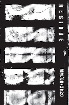 Residue
MM/DD/2020
Calamari Press
Residue is a collaboration between an artist (MM) and writer (DD), which took place during the pandemic (2020). Black and white abstractions—xerographic images including toner smears and drips—serve as the prompts for a series of stories titled like dates for diary entries. The stories read like descriptions of lucid dreams that include the narrator’s steadfast “bedder-½” and repeated (if unpredictable) appearances by the narrator’s dead parents and siblings, as those this were all happening in IRL. Supporting the disorienting juxtapositions between text and image (images not in the least representational) is DD’s use of puns, misspellings, and numbers-as-words/syllables. These effects enhance the blurriness and destabilizations of meaning, which is entirely appropriate for the oneiric states described.
With its use of xerography, typewriter font, phonetical spellings, and present-tense narration, MM and DD advance the aesthetic immediacy of lo-fi literature and art, coupled with an anti-status quo attitude.
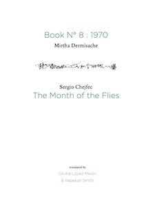 Book No. 8: 1970 / The Month of the Flies
Mirtha Dermisache and Sergio Chejfec / Silvina López Medin & Rebekah Smith
Ugly Duckling Presse
Mirtha Dermisache was an Argentine artist of asemic writing (scripts that look like some type of letters but which have no semantic content). Coupled with Dermisache’s lines that make up “Book No. 8: 1970” are “translations” or interpretations of those lines by fellow Argentinean Sergio Chejfec (whose own interpretations are translated by Silvina López Medin and Rebekah Smith, with comments by Chejfec on how he came to interpret Dermisache’s lines as he did).
Her lines are crabbed, forming tiny loops, swirls, and blots, often four to six lines a page, but increasing in number and pinched agitation, working toward a visual climax. Chejfec compliments Dermisache’s lines with a story (“The Month of the Flies”) about a boating excursion to a small island on the Argentine coast during the month flies hatch and swarm everywhere there. Chejfec matches Dermisache line for line, with adjustments in kerning between words and letters that mimic the density or looseness within each line, the density increasing as the swarms of flies increase.
An interesting and successful experiment in art and literature.
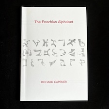 The Enochian Alphabet
Richard Capener
Timglaset [the publisher seems to now be defunct]
During the early 1580s, a script was foisted upon the public by an Edward Kelly and John Dee. Kelly claimed that the script was revealed to him while in psychic communication with the angels, which Dee transcribed (how the shapes of a script only heard are transcribed surpasses scientific knowledge). They believed / claimed that the script represents the language spoken by Adam and thus is the ur-language of all humanity. After this revelation, Western occultists used the language to open various spiritual dimensions of the Æther. (Hear the circus calliope playing in the background?) Unsurprisingly, the 21 letters of this Enochian alphabet correspond to the sounds associated with the 26 letters of the English alphabet—because of course Adam would have spoken proto-English.
That snide historical summary aside, Richard Capener has created a charming visual artefact of the Enochian alphabet using an old typewriter and a ribbon at the end of its inky life. The division between purely visual art and asemic writing is as blurry as the typescript reproduced here, each letter of the Enochian alphabet given form by hundreds of keyboard strokes of the letter(s) associated with each sound. The blurriness suggests a molecular bouncing around of the Enochian language’s elements, their vibrancy and potential—as if each letter were its own living entity, suggesting something about the nature of all languages to grow, change, and evolve.
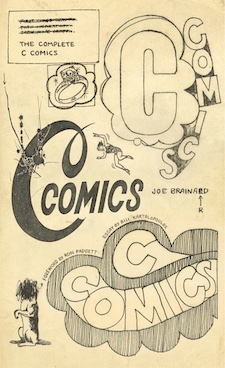 The Complete C Comics
Joe Brianard
NYRB Comics
The Complete C Comics comprised two issues published in 1964, coordinated and overseen by the artist and writer Joe Brainard (who drew the nearly 200 pages of illustrations appearing here) with contributions from and collaborations with John Ashbery, Frank O’Hara, Barbara Guest, and other affiliates of the New York School poets. The words and images unite the practices of Pop Art, Minimalism, and Surrealist absurdities in playful, spontaneous, and deliberately flawed ways that avoid engaging with the aesthetics of ugly. In short, The Complete C Comics feels like whimsy on a sunny day.
While NYRB is at it—publishing works that blur the lines between visual and verbal arts (under their “Comics” imprint, no less!) their editors might want to look into the collage cut-ups William Burroughs was also publishing at the same time with various ephemeral presses, including Boke Press, the original publisher of C Comics.
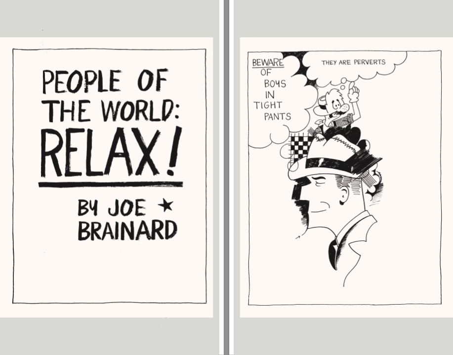
Joe Brainard from The Complete C Comics
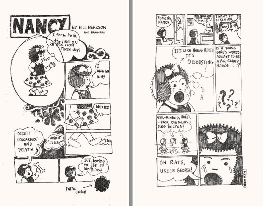
Joe Brainard from The Complete C Comics
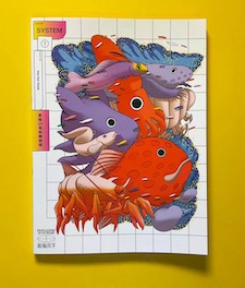 System 1: Hot Net Motel
Paradise Systems
R. Orion Martin’s Paradise Systems—dedicated to publishing comics from mainland China—initiates a new anthology series called System, its first volume, Hot Net Hotel, featuring previously unpublished works by 15 Chinese cartoonists. If there’s an American parallel to the stories comprising Hot Net Motel, it would be the alternative comics offering slice-of-life narratives or daydream-like fantasies. Frontal nudity and complaints directed against the Chinese Communist Party aren’t permitted on the mainland, and nobody in this anthology seems interested in pushing that boundary, even for a book that won’t be sold in China. Nonetheless, if the stories are taken as representative of their cultural milieu, they show exhaustion from trying to make ends meet, concern for environmental issues, and the pursuit of simple emotional comforts.
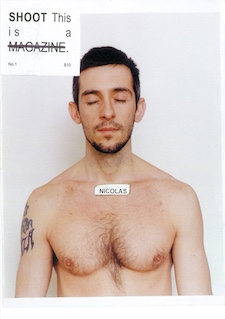 SHOOT
SHOOT
Paul Mpagi Sepuya
Primary Information
SHOOT was a lo-fi zine published from 2005-2008 by the photographer Paul Mpagi Sepuya. Each of SHOOT’s seven issues consists of black and white, nude / homoerotic portraits of friends, models, and lovers. A good example of what can be achieved when aesthetic understatement meets little means: a triumph of imagination over budget.